- Services
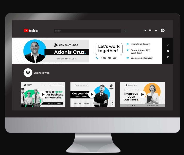
- Graphic Design
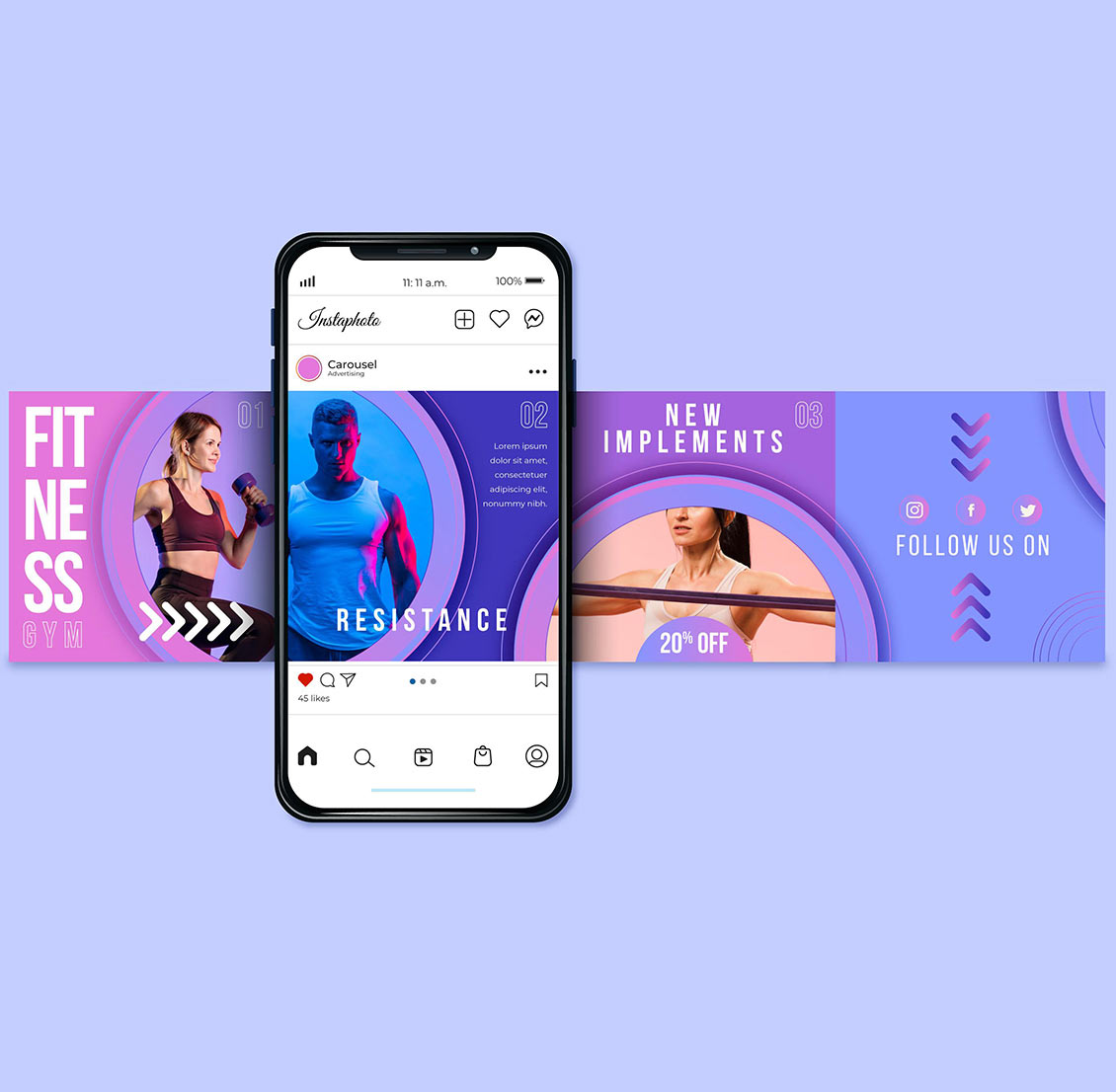
- Social Media
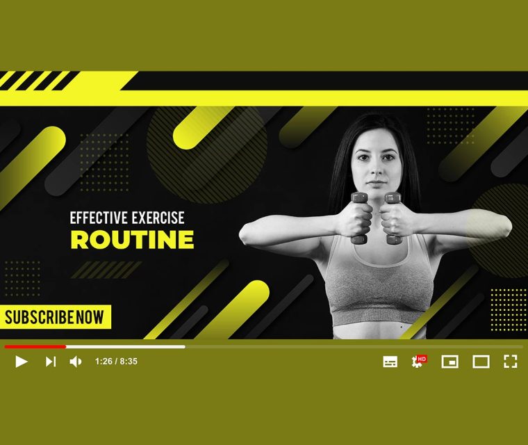
- Video & Audio
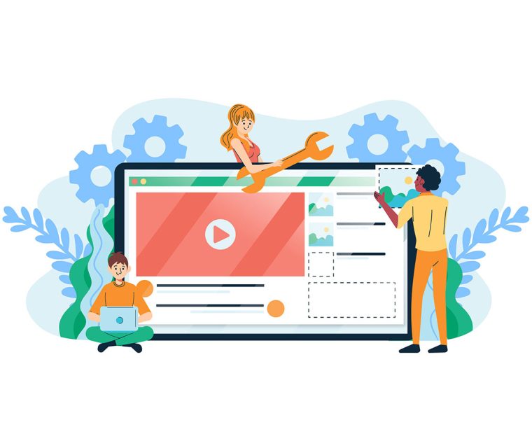
- Development & ITNew
- Interior & Exterior Design
- Pricing
- What’s new
- Contact
Type and hit enter
- Services
- Graphic Design
- Social Media
- Video & Audio
- Development & ITNew
- Interior & Exterior Design
- Pricing
- What’s new
- Contact