Social Media
Youtube thumbnail design
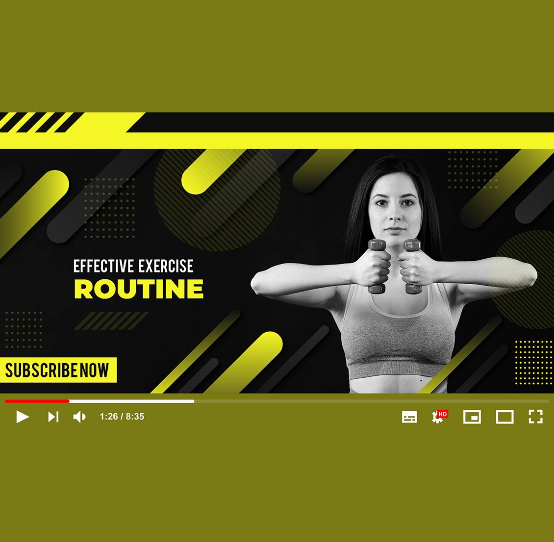
Designing an effective YouTube thumbnail is critical for increasing click-through rates (CTR) and attracting viewers. Here’s what to focus on:
- Composition & Visual Hierarchy
- Rule of Thirds: Place key elements (face, text, object) along grid intersections for balance.
- Contrast: Use bold colors to make the subject pop (e.g., bright text on dark backgrounds).
- Negative Space: Avoid clutter—leave room for the YouTube play button and timestamp.
- Text & Readability
- Short & Bold: 3-5 words max.
- Font Choice: Use thick, sans-serif fonts (e.g., Impact, Bebas Neue) at large sizes (visible on mobile).
- Outline/Shadow: Ensure text stands out against busy backgrounds.
- Imagery & Emotion
- Close-Up Faces: Expressive reactions (surprise, excitement) grab attention.
- High-Quality Images: Sharp, well-lit photos or screenshots (no pixelation).
- Symbols/Icons: Arrows, circles, or emojis (🔥, 💯) to emphasize key points.
- Brand Consistency
- Color Palette: Stick to 2-3 brand colors for recognition.
- Logo/Watermark: Subtle placement for brand recall.
- Template Style: Uniform layouts for series.
- Platform Optimization
- Dimensions: 1280×720 px (16:9 ratio) at 72 DPI.
- Mobile-Friendly: Test thumbnails at small sizes.
- No Misleading Imagery: Avoid clickbait that doesn’t match the video content.
- Psychological Triggers
- Curiosity Gaps: Tease outcomes (“You Won’t Believe What Happened!”).
- Urgency/Scarcity: “LAST CHANCE!” or “Limited Time!”
- Numbers/Lists: “5 Secrets You Didn’t Know.”
- A/B Testing & Analytics
- Test Variations: Try different thumbnails for the same video (use YouTube’s A/B testing tool).
- CTR Tracking: Aim for 5-10%+ CTR (analyze in YouTube Studio).


